0%
Efirmedia
A modern rebranding of a leading U.S. insurance firm
Summary
Johnson, Kendall & Johnson (JKJ) is a 60-year old, independent insurance brokerage firm from Newtown, Pennsylvania. As part of their corporate rebranding exercise, we were asked to create a new and strong visual identity that maintained a connection to the company’s older and conservative values, while also communicating the brand in a friendly, relatable way to newer and younger clients.

Client
Johnson, Kendall & Johnson (JKJ) is an independent insurance brokerage firm based in Newtown, Pennsylvania. The Johnson, Kendall & Johnson family of companies has grown into one of the leading insurance brokerage firms in the United States, operating for over 60 years and helping thousands of clients, from Fortune 1000 companies to self-employed individuals and families.
Challenge
JKJ wanted us to create a new, fresh and modern look for their company. At the time, the brand design was outdated and JKJ wanted to update all of their brand elements, ensuring at the same time their signature look could be easily recognized by customers. Our challenge was to preserve the feeling of a prestigious, stable and solid legacy company, while giving it a new contemporary look to attract younger customers.
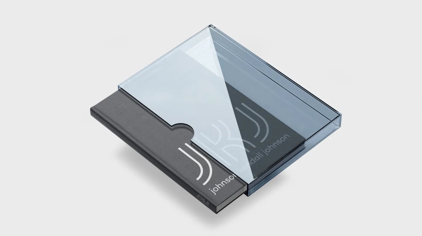
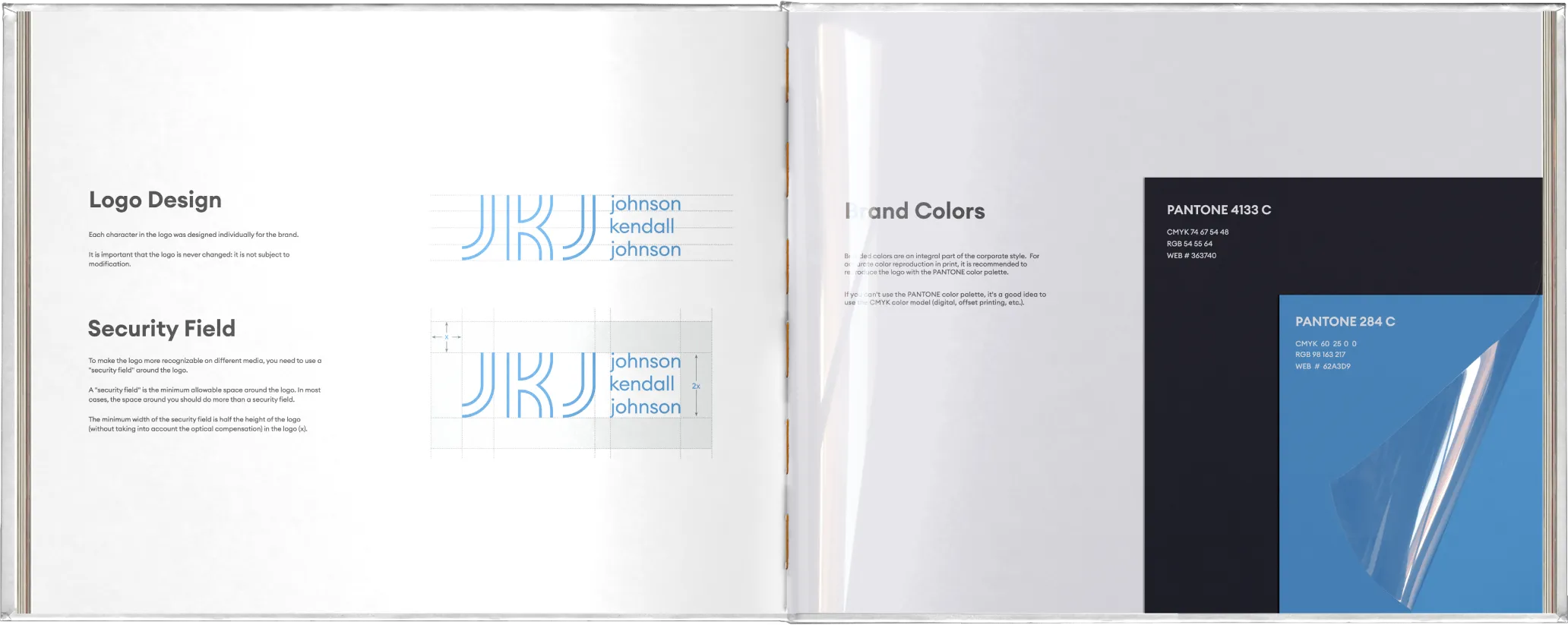
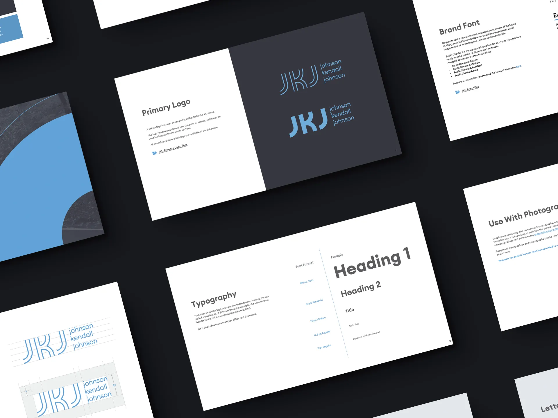
Brandbook
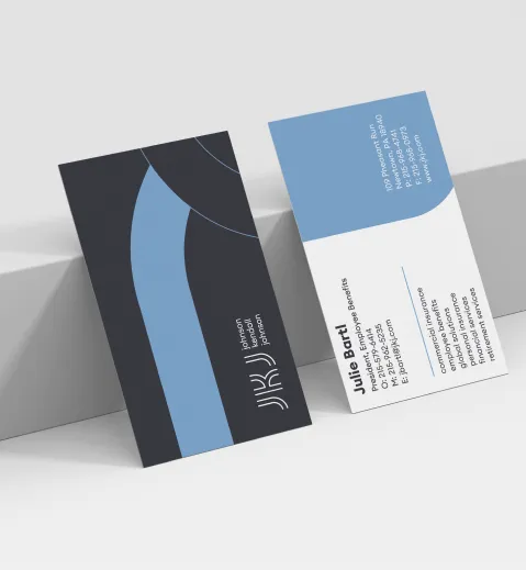
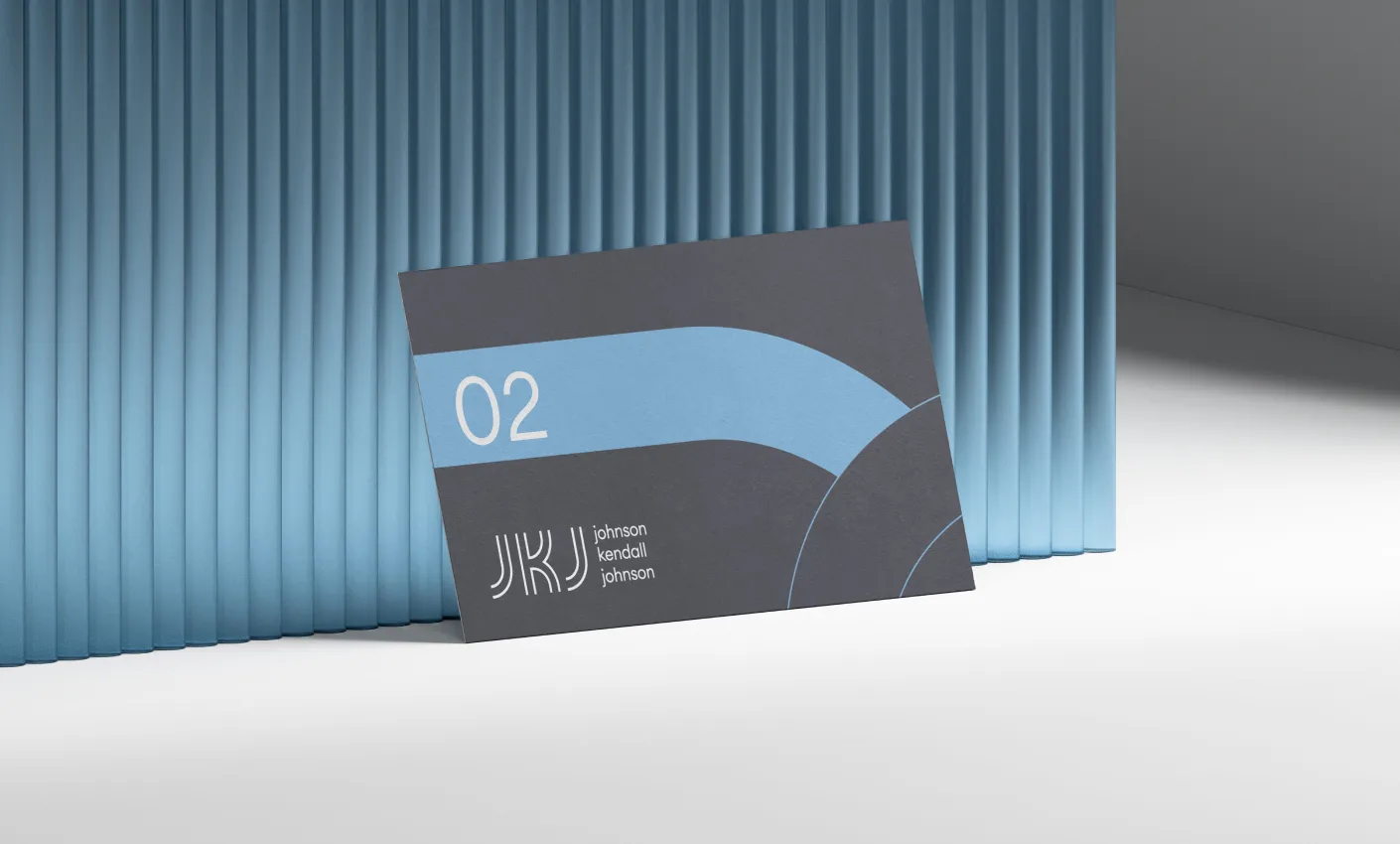
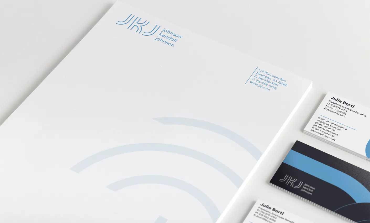
Business card
Commercial proposal
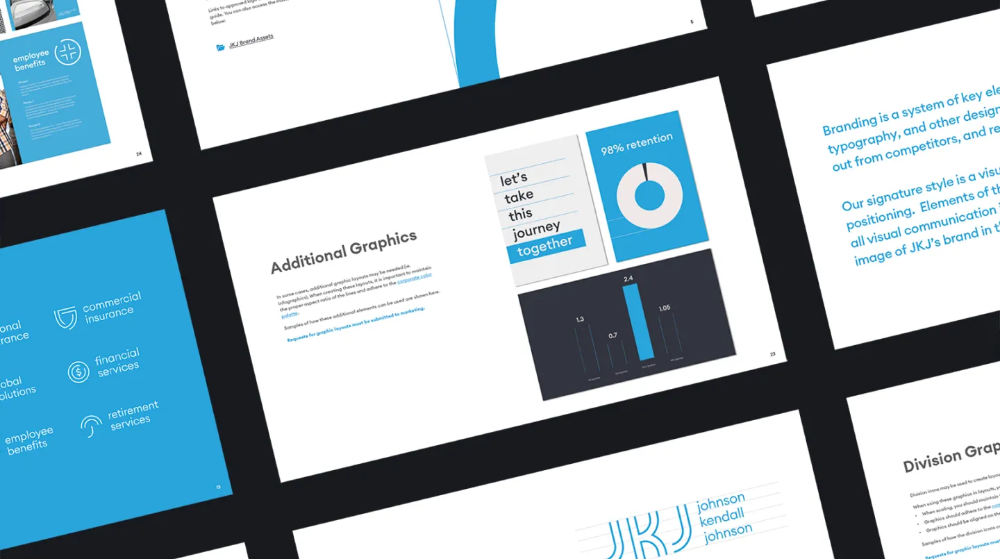
Icons
Badge
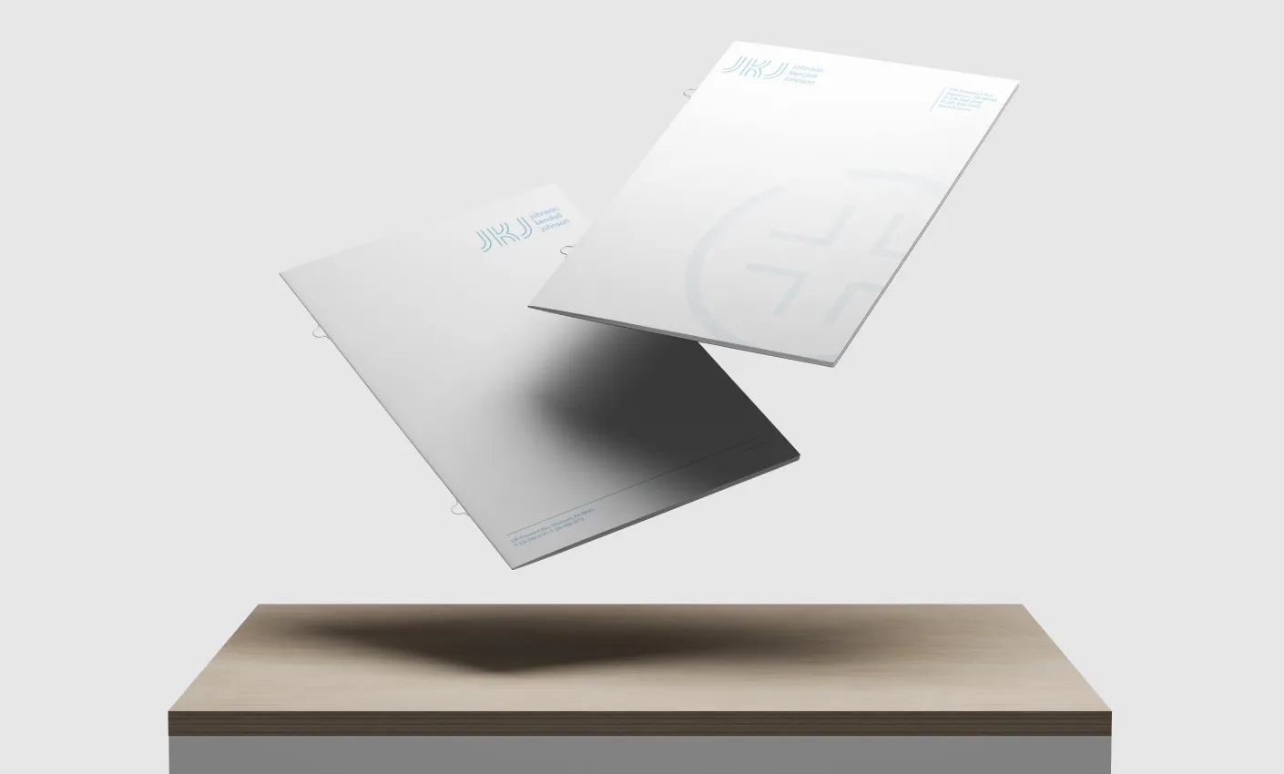
Envelope
Catalog
Strategy
We decided to build a new brand look from the ground up around a new brand personality. Key stylistic elements, like colors and fonts, were conserved to maintain the connection to the company’s rich history and existing customer base, and the balance between modern and conversative was integrated into every choice made throughout the process.
Solutions
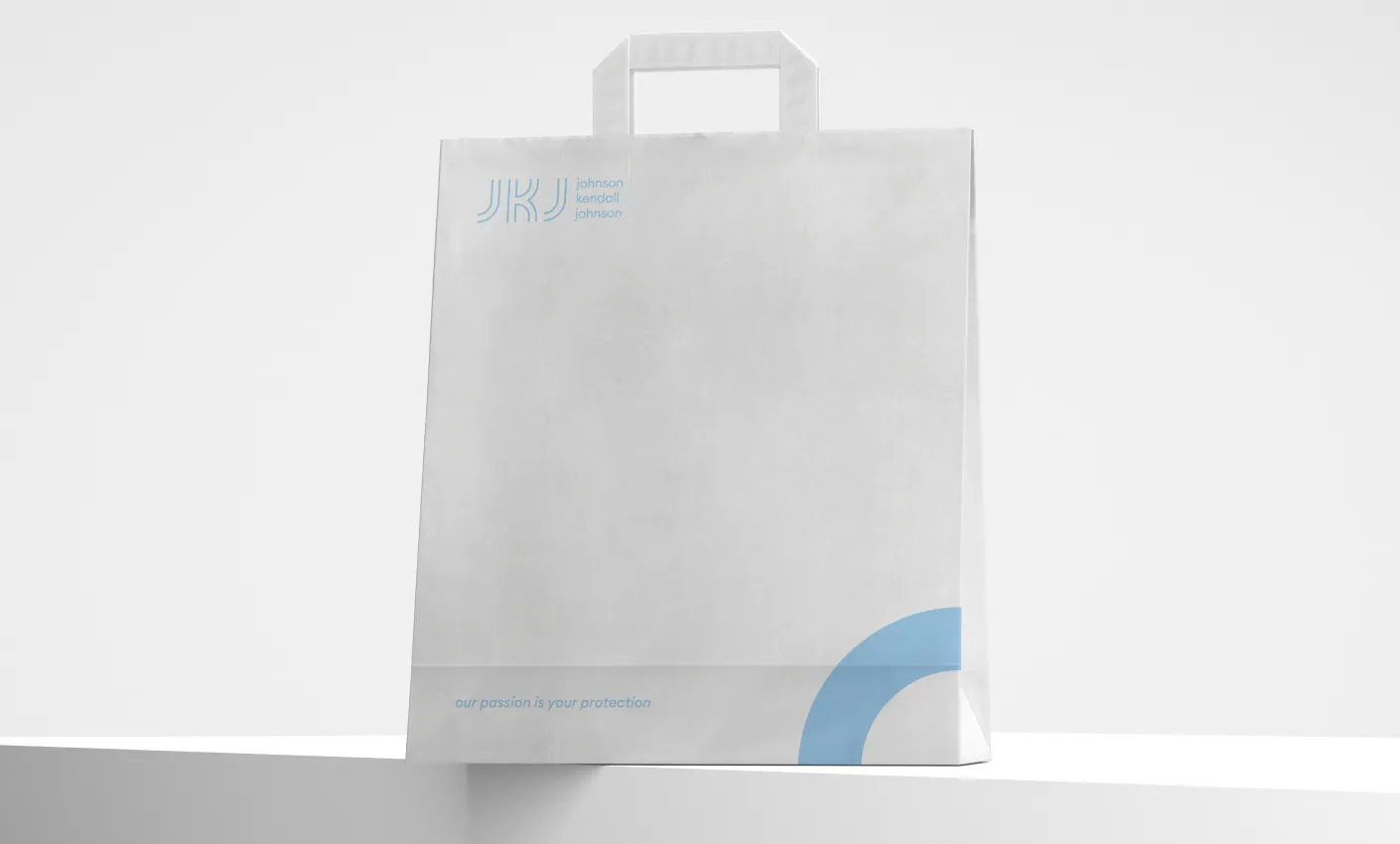
As part of our work, we developed the following elements of JKJ’s new brand look:
- Logo (3 different variations)
- Colors
- New shapes and elements to be used with the style
- Font sets
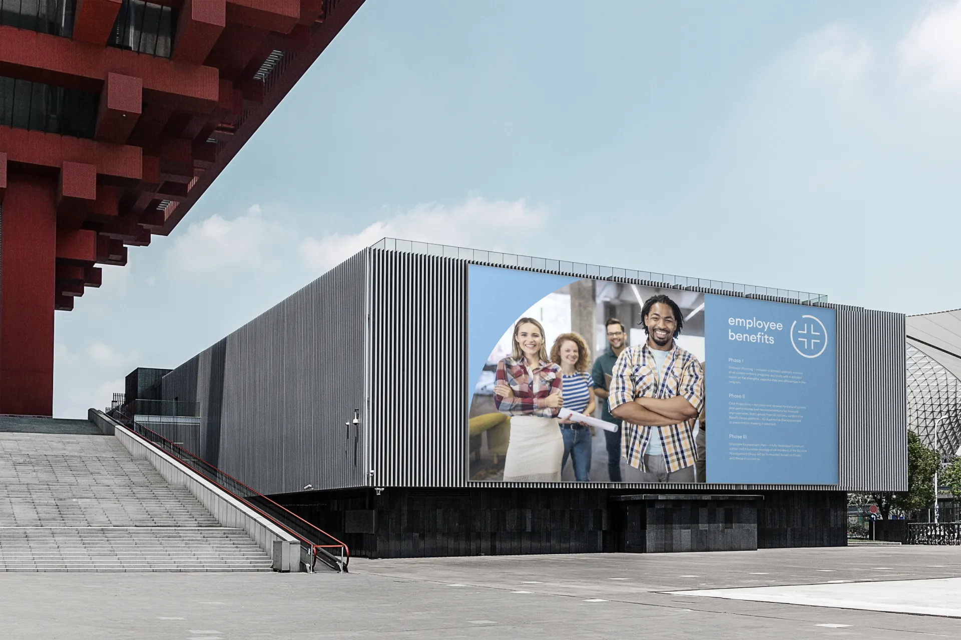
- Printed materials (Business cards, Letterhead, Brochure, Envelope)
- Style Guide/Brandbook
- Developed set of sub logos for different departments
Result
Upon delivery, JKJ found themselves with a new exciting brand look that brought them from the 20th Century into the 21st Century. Respected by existing loyal customers and appreciated by new younger prospects, the company's new and modern brand identity helped them stand tall against their competitors' outdated brands and gave them a perfect platform to further develop their website inline with their new look.

Efir Media's group triumphantly created a brand identity that the company finds attractive. It really represented the brand's true culture and vision for the future and how it would like to appeal to its existing and new customers. Their passion for research and their ability to listen is admirable
Leigh Rubin, Marketing Director at Johnson, Kendall & Johnson
More projects